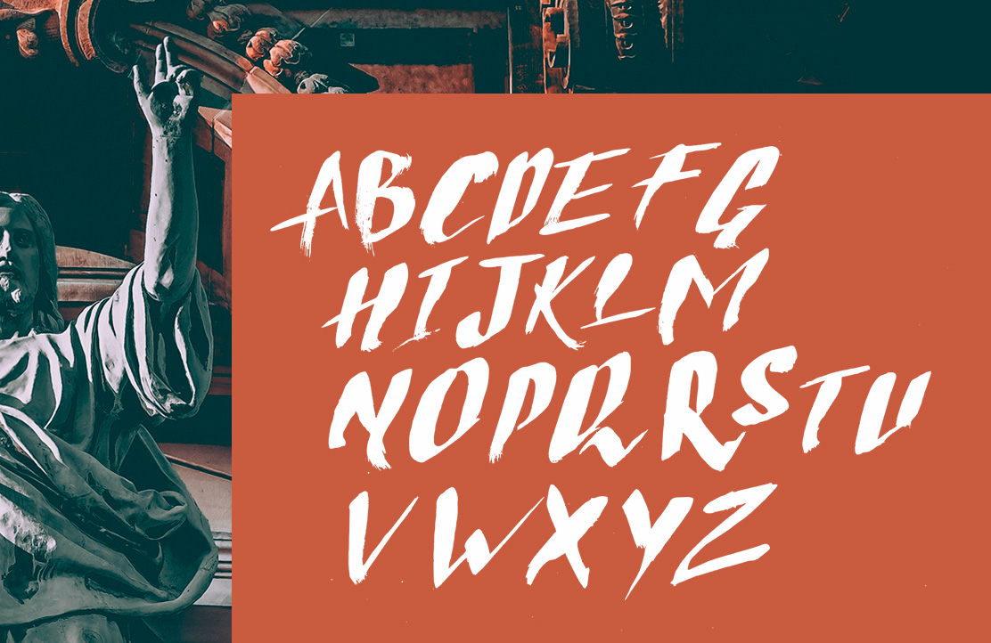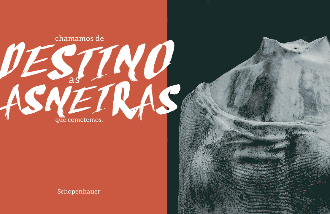
It's an embrionary and experimental project to build a complete typography, viable and highly expressive. As the name suggests, it's a derivation of "error", "to miss", and the font as the intention of not respecting the classical norms of typographic construction, as, for example, the Romans types.
Typography, Design & Finalization: Iago Silva
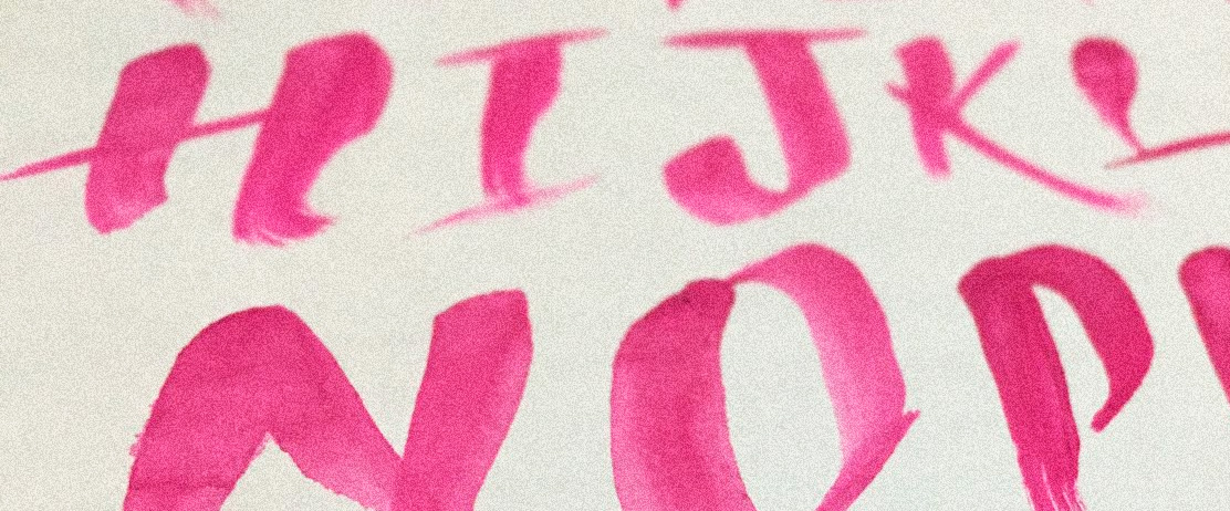
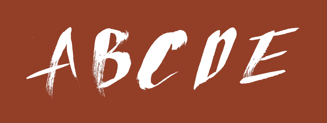
Starting from the premises of building one expressive typography, wrong and handmade, I drew the uppercase characters with brush and paint, I wanted to keep the traces of authorial on the brush strokes, in the body cross bars, and terminals. The letters don't follow the building logic, each one is unique and harmonious at the same time as the others.