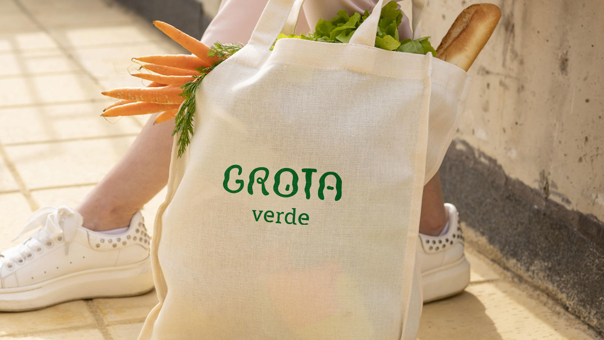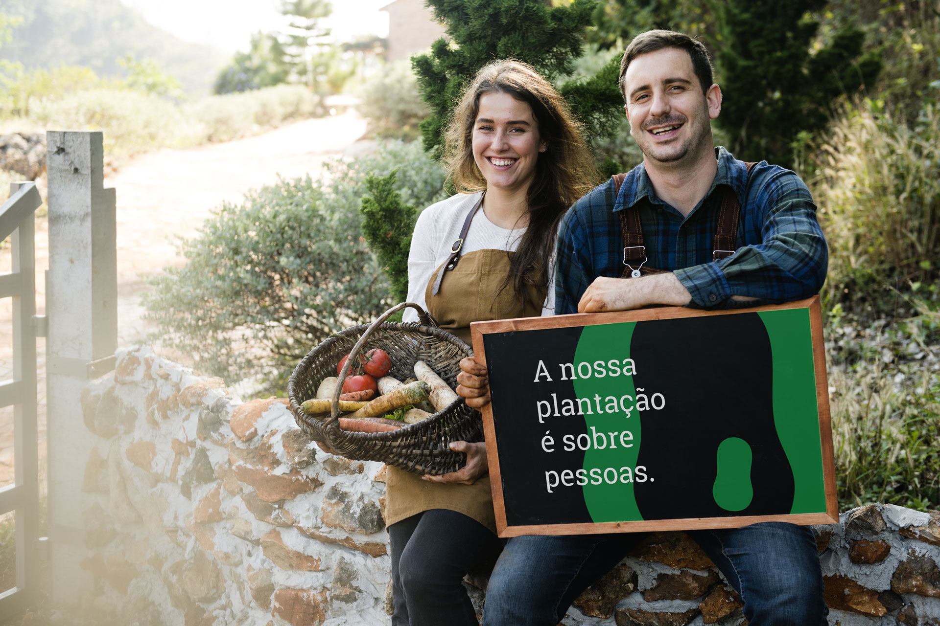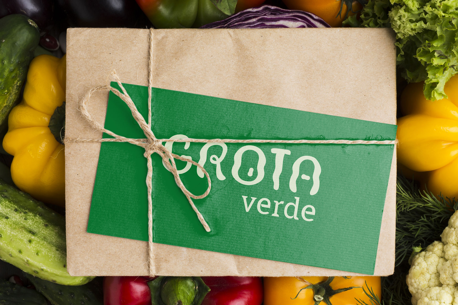
It's a farming and familiar brand, which produces organic green vegetables and has as its goal to create a natural and close bond with customers, delivering organic products directly to the people's houses. There were also partners in commercial points, such as groceries stores, and supermarkets, with products available on immediate delivery.
Art Direction, Copywriting, Design,Typography & Animation : Iago Silva
Customer Representative : Tiago Brunner
Original Project : StudioBrunner
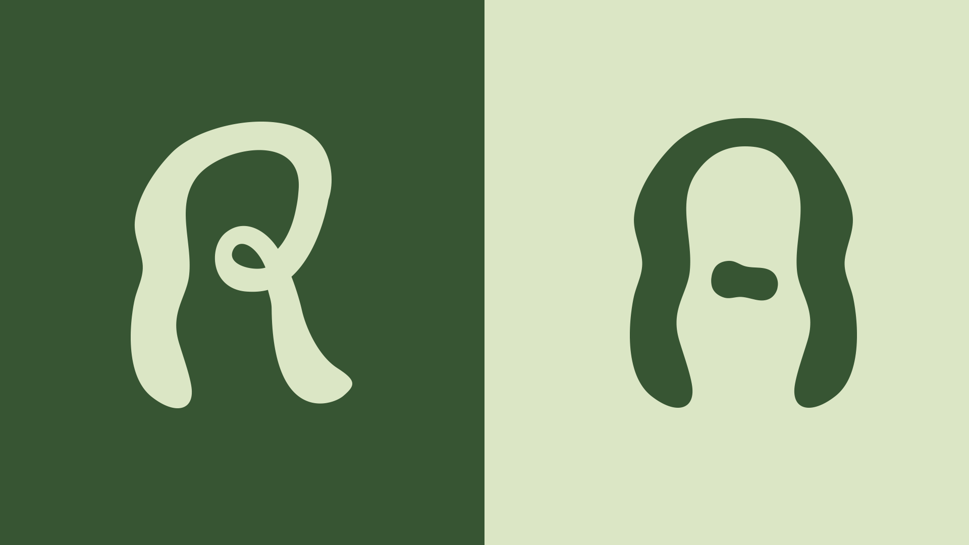
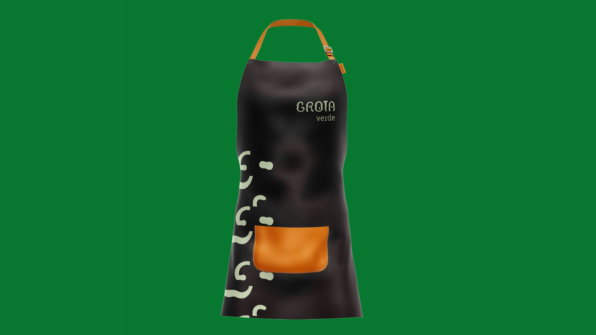
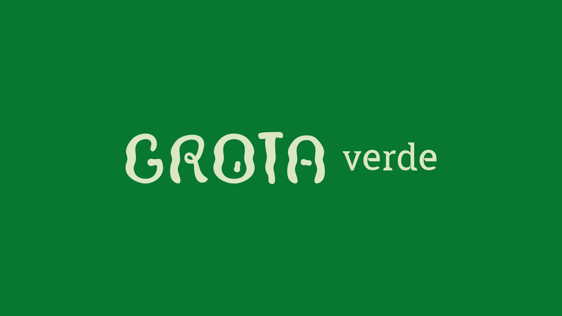
The purpose was strengthening the organic sector, production, and delivery of healthy food with respect for nature and all people involved in that process, natural products and totally free of agro toxics or chemical products. The brand's typographic drawing start on letter "O" and has as a reference the local topography itself: the grotto, a cave, with slopes and hills, produced by rainwater or floods. So, the concepts of roots and origin are present, as well as the innovative and strategic use of own typography, organic and that, semiotically relates to the seed and curved forms found in nature itself. The argument and copywriting goes in the same direction, in order to prioritize the human tone of voice, respectful, and focused on nature, that comprehends, also, we human beings.